|
Top Jewellery Trends, Fashion

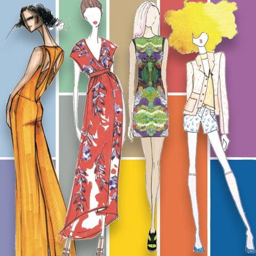
Pantone reveals its 2014 spring colour chart
2014 Spring colour trends for jewellery
 10.2 k views | Posted September 09, 2013 10.2 k views | Posted September 09, 2013 | By India Nicholson• Staff Journalist
While spring this year has only just arrived, Pantone is already looking
ahead, having just released its guide to the upcoming Northern
Hemisphere spring 2014 colour trends.
Inspired by blooming flowers, traveling abroad and confident women, Pantone has banded together designers from New York Fashion Week and beyond to create a refreshing, vibrant palette for 2014.
For more than 20 years, Pantone has been identified worldwide as the experts on colour, influencing the hue palette for fashion each season. Every year the company surveys designers, including those involved in New York Fashion Week, to establish the major and most outstanding hues.
The collection of colours for spring centre on artistic equilibrium. Executive director of Pantone Color Institute Leatrice Eiserman said, “While this need for stability is reflected in the composition of the palette, the inherent versatility of the individual colors allows for experimentation with new looks and colour combinations."
First on the palette are the very adaptable pastels. Drawing inspiration from nature, the three pastels can be combined with any colour on the spectrum. Placid Blue provokes calmness and a sense of peacefulness. Violet Tulip is a vintage purple, enhancing a romantic feel. Hemlock mirrors the springtime foliage and provides a summery, ornamental green that is unique from previous greens of recent seasons.
The staple colours of the season are born in Sand and Paloma. Sand is a lightly toasted, neutral hue, which summons excitement for the relaxing days on the beach. Paloma is an essential neutral that can be combined with any colour or can be worn alone, creating balance on the lively palette.
Next on the spectrum are the boisterous, noisy and vibrant colours of Cayenne, Freesia and Celosia Orange. Cayenne is a spicy red that heats up the neutrals, whereas Freesia is a blazing yellow that attracts much attention. Warm with energy, Celosia Orange is a spontaneous hue, inspired by tropical flowers.
Completing the colour wheel are the striking counterparts of Violet Tulip and Placid Blue, found respectively in Radiant Orchid and Dazzling Blue. Both of these arresting hues pair with every colour across the palette. Perfectly combined with its companion pastel and screaming confidence when united with the fiery hues, these colours can also be considered staples for the season.
Be ahead of the game with season trends and consider Pantone’s palette in your upcoming retail collections. Below are some jewellery pieces from Australian brands that have incorporated Pantone’s colour forecast.
Placid Blue
Violet Tulip
Hemlock
Paloma
Sand
Freesia
Cayenne
Celosia Orange
Radiant Orchid
Dazzling Blue
-
While you're here, connect with Jeweller


|
|
|
|